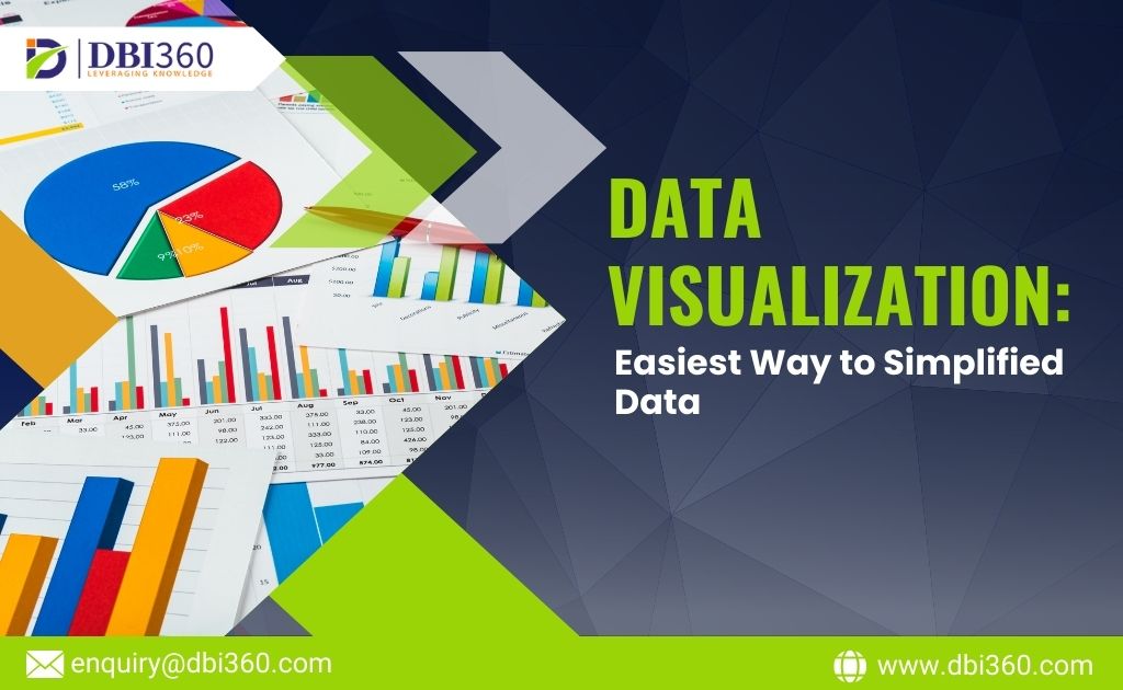
The capacity to rapidly analyze data and reach well-informed conclusions is essential in the fast-paced business world of today. With the help of data visualization, one can effectively convert complicated data sets into understandable and useful insights. This guide examines how using data visualization can improve decision-making and demonstrates how DBI360’s product suite can assist companies in doing so.
The Importance of Data Visualization
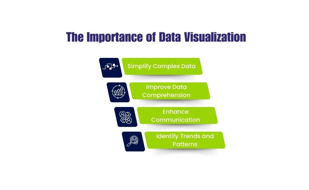
Data visualization is more than just creating attractive charts and graphs. It involves representing data in a visual context to make it easier to understand patterns, trends, and outliers. When businesses can see their data, they can grasp difficult concepts or identify new patterns that might be missed in raw data. Effective data visualization can:
- Simplify Complex Data: By converting data into a visual format, businesses can simplify the complexity and focus on critical insights.
- Improve Data Comprehension: Visual data is easier to interpret, leading to faster and better decision-making.
- Enhance Communication: Visuals can communicate findings more effectively, making it easier to share insights with stakeholders.
- Identify Trends and Patterns: Visualization helps in spotting trends and patterns that may not be immediately obvious from spreadsheets.
How DBI360 Enhances Data Visualization
DBI360 offers a comprehensive suite of products designed to help businesses harness the power of data visualization for better decision-making. Here’s how some of these products can transform your data into actionable insights:
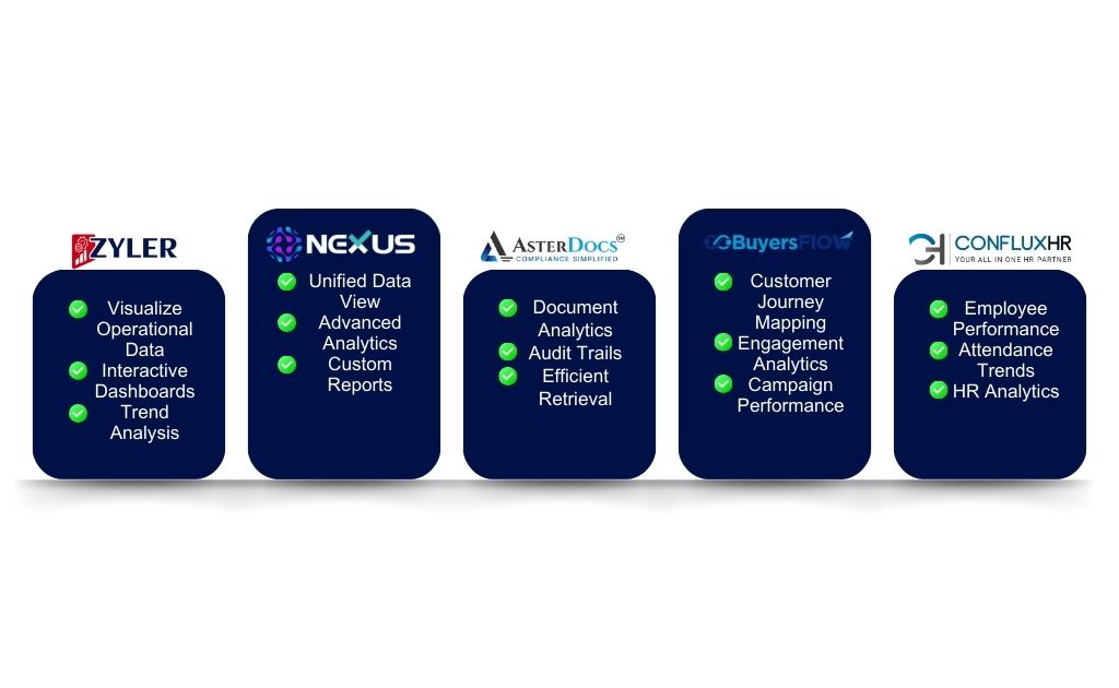
ZylerERP: Streamlined Data Visualization for Operations
ZylerERP is a powerful enterprise resource planning tool that integrates various business processes. One of its standout features is its robust data visualization capabilities. With ZylerERP, you can:
- Visualize Operational Data: Generate real-time visual reports on inventory, sales, and other operational metrics.
- Interactive Dashboards: Customize dashboards to track key performance indicators (KPIs) and make informed decisions quickly.
- Trend Analysis: Use visual analytics to identify trends in sales, production, and supply chain operations, enabling proactive management.
Nexus: Centralized Data Integration and Visualization
Nexus acts as a central hub for data integration, ensuring that all your data sources speak the same language. Its visualization tools are designed to provide comprehensive insights across the organization:
- Unified Data View: Integrate data from multiple sources into a single view, providing a holistic perspective of your business operations.
- Advanced Analytics: Utilize sophisticated visualization tools to analyze integrated data, uncovering hidden insights and patterns.
- Custom Reports: Create custom visual reports that cater to specific business needs, facilitating targeted decision-making.
AsterDocs: Document Management with Visual Insights
AsterDocs is more than just a document management system; it also offers powerful visualization features:
- Document Analytics: Visualize document-related data to understand usage patterns, compliance status, and document workflows.
- Audit Trails: Use visual tools to track document access and modifications, ensuring transparency and accountability.
- Efficient Retrieval: Quickly find and retrieve documents using visual search and filter options, enhancing operational efficiency.
BuyersFlow: Visualizing Customer Interactions
BuyersFlow focuses on enhancing customer interactions through data-driven insights. Its visualization features are crucial for understanding customer behavior:
- Customer Journey Mapping: Visualize the entire customer journey, identifying key touchpoints and areas for improvement.
- Engagement Analytics: Track and visualize customer engagement metrics, enabling targeted marketing strategies.
- Campaign Performance: Analyze and visualize the performance of marketing campaigns, making it easier to optimize for better results.
ConfluxHR: Visual HR Insights
ConfluxHR is a comprehensive HR management solution with robust data visualization tools to help manage your workforce effectively:
- Employee Performance: Visualize performance metrics to identify top performers and areas needing improvement.
- Attendance Trends: Use visual reports to monitor attendance patterns and manage workforce scheduling efficiently.
- HR Analytics: Leverage HR data to create visual insights into employee engagement, satisfaction, and retention.
Conclusion
Data visualization is a game-changer for businesses looking to make data-driven decisions. By transforming raw data into visual insights, companies can simplify complexity, improve comprehension, and communicate findings effectively. DBI360’s suite of products, including ZylerERP, Nexus, AsterDocs, BuyersFlow, and ConfluxHR, provides powerful tools to harness the power of data visualization, ensuring better decision-making and driving business success.
Discover how DBI360 can revolutionize your data visualization efforts and empower your business with actionable insights. Visit DBI360 today!